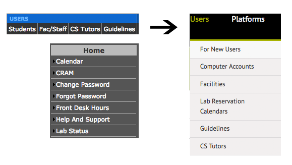
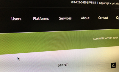
Although the layout has changed, the new CAT website contains all of the old content. The restructuring involved moving things under a less-cluttered top level menu with drop downs appearing when you mouse over some menu items. The new site is more mobile-friendly and provides us with a more flexible framework to add new content.
Much of the reshuffle involves three sections – Users, Platform and Services.
Users section:

The focus here is on things users interact with directly (user services stuff). Facilities, a new section, collects information on computer labs, reservations, card, access, lockers, and things related to getting computers bought and set up (deployments). Lab reservation calendars, a popular destination, has been broken up into individual room pages. (This is more a side effect of the plugin we’re using to implement it. We’ll be looking at providing an additional combined view for everything when the dust settles.)
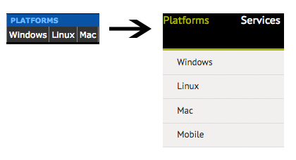
Platforms section:

This is still the same breakdown as before – Windows, Linux, and Mac related topics. Experienced users will typically go straight here. We added a new Mobile tab that we hope to expand to provide resources for iOS and Android users.
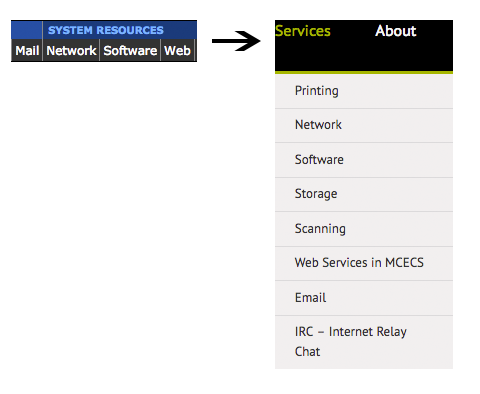
Services section:

In addition to some of the items that were under the old Resources section, we have also taken some chunks out of the platforms area. Where appropriate, the Services topics may provide pointers back to platform-specific pages for technical details.
The new front page has:
Downtime postings separated from general system news annoucements. Both these appear on the right sidebar.
Links to popular topics (based on queries we receive over our support lines and in person) displayed in blocks, broken into:
- New Users
- Computer Accounts
- Computer Labs
- Remote Access
- Printing
- Self-Service Quick links
Packing the footer with many of these same links. The footer appears on all pages of the website.
Three featured news items across the top.
If you find anything missing or broken with the site, please contact us.

